Table of Contents
Get to know the data
In the United States especially many college courses conclude by giving students the opportunity to evaluate the course and the instructor anonymously. However, this way of evaluating a course is highly criticized as it is argued that students’ evaluation does not reflect course quality of teaching effectiveness but may rather reflect “non-teaching” related characteristics such as physical appearance of the teacher. These were the results of the paper Beauty in the classroom: instructors’ pulchritude and putative pedagogical productivity by Hamermesh & Parker.
In this lab we will analyze the data from this study and learn what goes into a positive professor evaluation.
The data were gathered from end of semester student evaluations for a large sample of professors from the University of Texas at Austin. In addition, six students rated the professors’ physical appearance. (This is a slightly modified version of the original data set that was released as part of the replication data for Data Analysis Using Regression and Multilevel/Hierarchical Models (Gelman and Hill, 2007).) The result is a data frame where each row contains a different course and columns represent variables about the courses and professors.
Package
In this lab we will use the package tidyverse that you already know, the package openintro which contains the data we need to do this lab and finally the package broom which help you clean or tidy your model output.
To install the packages openintro and broom write in your console or a script:
install.packages('openintro')
install.packages('broom')
Then load the libraries you will need for the exercise:
library(tidyverse)
library(openintro)
library(broom)
Exercises
The dataset we’ll be using is called evals from the openintro package.
Store the dataset evals in the object data as follow:
data <- openintro::evalsTake a glance at the dataset:
head(data)
# A tibble: 6 x 23
  course_id prof_id score rank  ethnicity gender language   age
      <int>   <int> <dbl> <fct> <fct>     <fct>  <fct>    <int>
1         1       1   4.7 tenu~ minority  female english     36
2         2       1   4.1 tenu~ minority  female english     36
3         3       1   3.9 tenu~ minority  female english     36
4         4       1   4.8 tenu~ minority  female english     36
5         5       2   4.6 tenu~ not mino~ male   english     59
6         6       2   4.3 tenu~ not mino~ male   english     59
# ... with 15 more variables: cls_perc_eval <dbl>,
#   cls_did_eval <int>, cls_students <int>, cls_level <fct>,
#   cls_profs <fct>, cls_credits <fct>, bty_f1lower <int>,
#   bty_f1upper <int>, bty_f2upper <int>, bty_m1lower <int>,
#   bty_m1upper <int>, bty_m2upper <int>, bty_avg <dbl>,
#   pic_outfit <fct>, pic_color <fct>
There are a lot of variables in this dataset. To get an explanation of what the variables mean write ?evals.
Part 1 - Exploratory Data Analysis
As I have explained in previous labs, the first step in all data analysis is data exploration or data visualization.
Question 1: Visualize the distribution of score. Is the distribution skewed (i.e. does your data look normally distributed or are they concentrated towards certain values)? What does that tell you about how students rate courses? Is this what you expected to see? Why, or why not? Include any summary statistics and visualizations you use in your response.
For example, I could visualize how score is distributed relative to whether the professor wore an formal or not formal outfit:
ggplot(data, aes(y=score, x= pic_outfit)) + geom_boxplot() + theme_bw()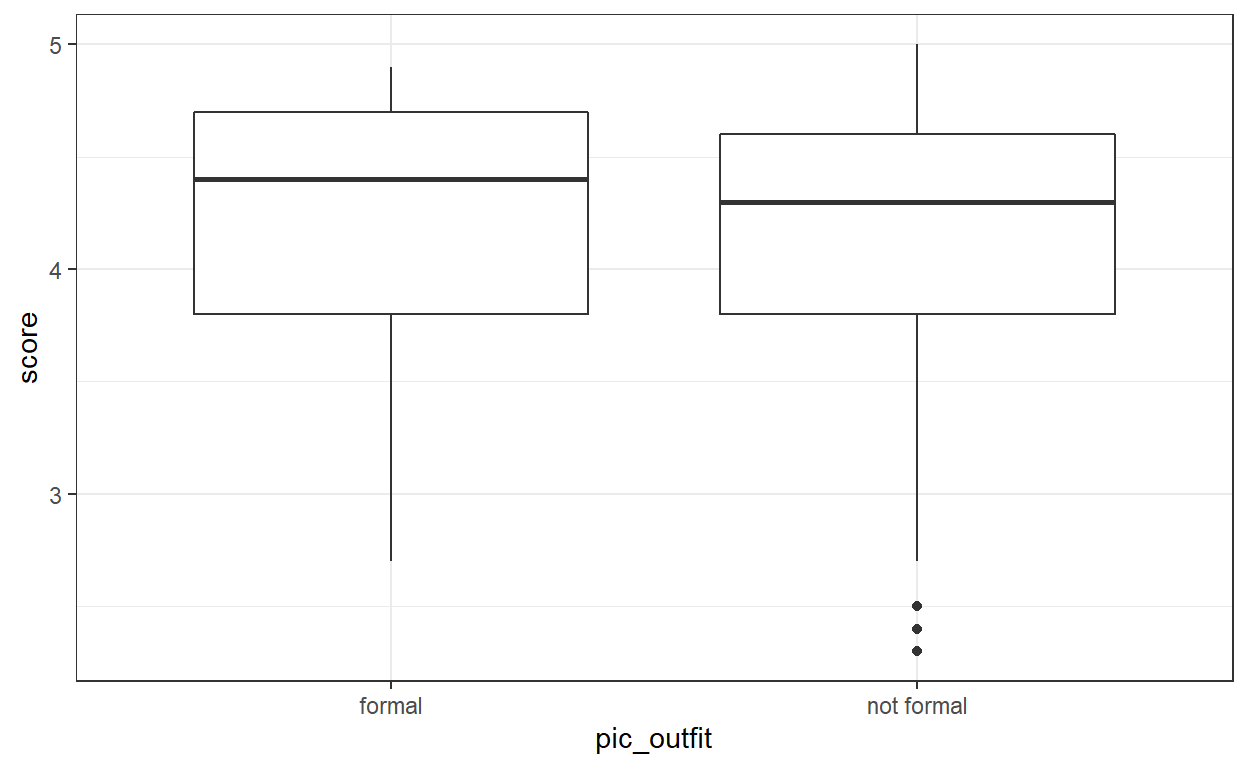
Visually I can see that the mean score for professor wearing formal outfit is higher than if they wear non formal outfit.
I could confirm this intuition by computing a summary statistic using group_by and summarise
data %>%
  group_by(pic_outfit) %>%
  summarise(score_mean = mean(score))
# A tibble: 2 x 2
  pic_outfit score_mean
  <fct>           <dbl>
1 formal           4.22
2 not formal       4.17
Question 2: Visualize and describe the relationship between score and bty_avg.
Question 3: Replot the scatterplot (the point cloud) from the previous question, but this time use geom_jitter()? What does “jitter” mean? What was misleading about the initial scatterplot?
Part 2 - Linear regression with a numerical predictor
Visually analyzing data can give some some intuition about the effects of some variables on our response variable (here score). However, visual can sometimes be misleading and we need to carry out a statistical analysis to help us infer if our intuition is real or if it is only natural variation resulting from noise in the data.
Question 4: Let’s see if the apparent trend in the plot is something more than natural variation. Fit a linear model called m_bty to predict average professor evaluation score by average beauty rating (bty_avg). Based on the regression output, write the linear model and interpret your model
Note: A linear model is in the form \(\hat{y} = \beta_0 + \beta_1x\)
Question 5: Replot your visualization from Question 3, and add the regression line to this plot in orange color. Turn off the shading for the uncertainty of the line.
Hint: there is multiple method to plot the regression line. One alternative when you only have on covariate is to use
geom_smoothas we saw in earlier labs. Another alternative is to use the functionpredict, which is a bit more complicated to use but which will become useful when our model include multiple predictor variables. I will cover thepredictfunction in the next lab, until then you can have a look at how to use it here
At this point your scatterplot should look like this:
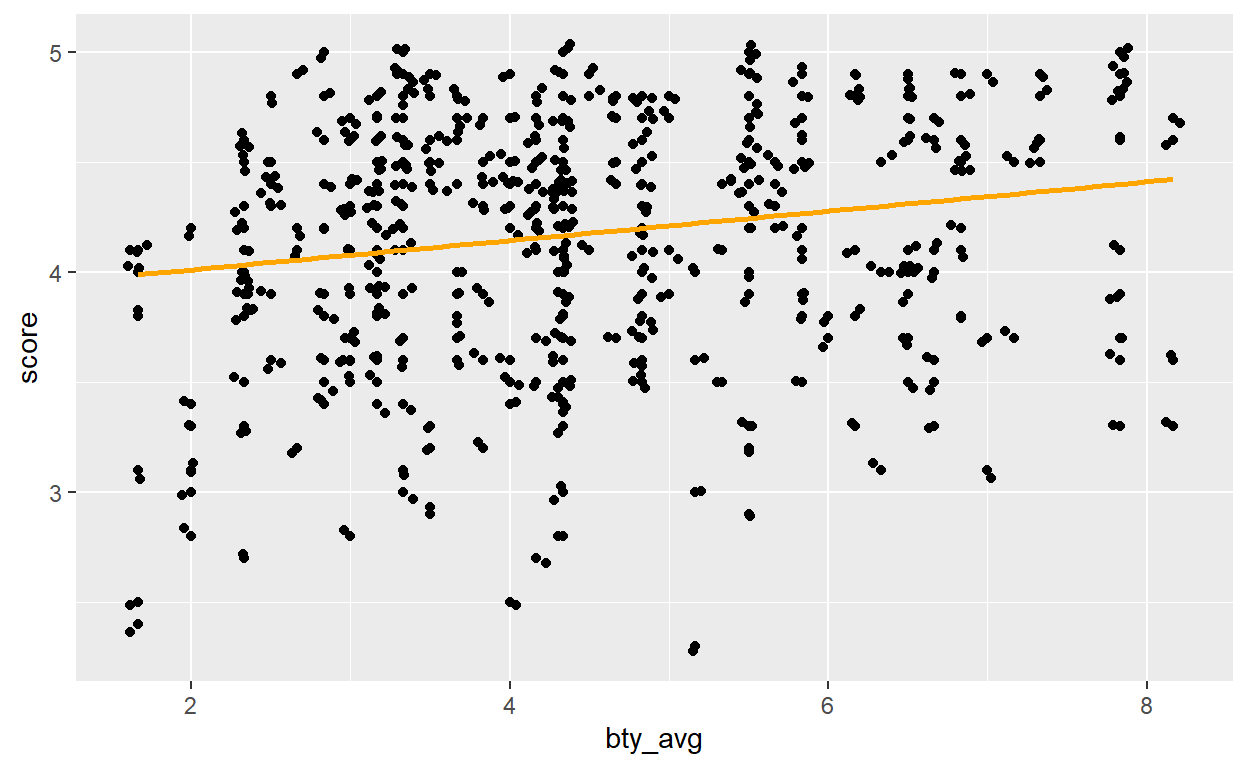
Question 6: Interpret the slope of the linear model in context of the data.
Question 7: Interpret the intercept of the linear model in context of the data. Comment on whether or not the intercept makes sense in this context.
Part 3: Linear regression with a categorical predictor
Previously, our linear model was trying to explain our response variable score with bty_avg, which is a numerical variable. Now you will construct a linear model trying to explain our response variable score with a categorical variable. Even though you did not see that yet, try to answers the following questions. We will learn more about categorical variables in the next lab exercise.
Question 8: Fit a new linear model called m_gen to predict average professor evaluation score based on gender of the professor. Based on the regression output, write the linear model and interpret the slope and intercept in context of the data.
Question 9: What is the equation of the line corresponding to male professors? What is it for female professors?
Good luck! 💪