Table of Contents
Exercises correction
# Load the library
library(ggplot2)

# First, open the dataset
plastic_waste <- read.csv('C:/Users/benjamcr/Rproj/GEOG3006/data/plastic_waste.csv')

# Visualize how the dataset look like
head(plastic_waste)
  code         entity continent year gdp_per_cap
1  AFG    Afghanistan      Asia 2010    1614.255
2  ALB        Albania    Europe 2010    9927.182
3  DZA        Algeria    Africa 2010   12870.603
4  ASM American Samoa   Oceania 2010          NA
5  AND        Andorra    Europe 2010          NA
6  AGO         Angola    Africa 2010    5897.683
  plastic_waste_per_cap mismanaged_plastic_waste_per_cap
1                    NA                               NA
2                 0.069                            0.032
3                 0.144                            0.086
4                    NA                               NA
5                    NA                               NA
6                 0.062                            0.045
  mismanaged_plastic_waste coastal_pop total_pop
1                       NA          NA  31411743
2                    29705     2530533   3204284
3                   520555    16556580  35468208
4                       NA          NA     68420
5                       NA          NA     84864
6                    62528     3790041  19081912
Question 1
Question 1: Visualize the relationship between plastic waste per capita and mismanaged plastic waste per capita using a scatterplot. Describe the relationship.
ggplot(plastic_waste, aes(x = plastic_waste_per_cap, y = mismanaged_plastic_waste)) +
  geom_point() +
  theme_bw() +
  geom_smooth()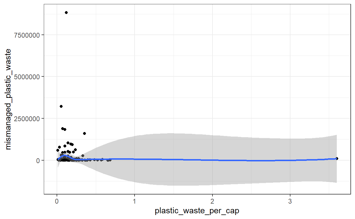
# The trend looks constant. It seems that there is no relationship between plastic waste per capita and plastic waste mismanagement.This first visualization indicates there are some extreme values in the dataset. While these are important and you should always try to understand these values called outliers, you should also explore your dataset without the outliers.
library(dplyr)

plastic_waste_no_outliers <- plastic_waste %>%
  filter(plastic_waste_per_cap < 1) %>%
  filter(mismanaged_plastic_waste < 50000)

ggplot(plastic_waste_no_outliers, aes(x = plastic_waste_per_cap, y = mismanaged_plastic_waste)) +
  geom_point() +
  theme_bw() +
  geom_smooth(method = 'lm')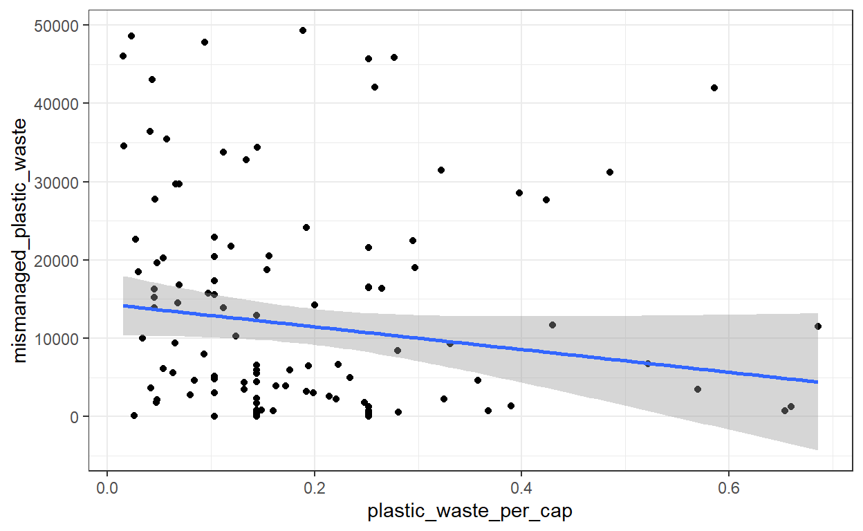
# The more plastic waste per capita, the less mismanaged is the plastic waste. Put in #another way, countries with high plastic waste per person are the countries which #manage better the plastic waste.In the geom_smooth() function, which evaluate the trend in your graph, we specify method = 'lm'. lm will return a straight line, which makes the interpretation easier. If method = 'lm' is not specified, the function may return a wiggly curve difficult to interpret.
Try out the above code without the
lmmethod specified.
The code above use the function filter() and the pipe %>%, both from the package dplyr. Through the R exercises we will use these functions a lot. Below you will find an explanation of these functions.
Can you guess what are
filter()and%>%doing?
Question 2
Question 2: Color the points in the scatterplot by continent. Does there seem to be any clear distinctions between continents with respect to how plastic waste per capita and mismanaged plastic waste per capita are associated?
ggplot(plastic_waste_no_outliers, aes(x = plastic_waste_per_cap, y = mismanaged_plastic_waste, color = continent)) +
  geom_point() +
  theme_bw() +
  geom_smooth(method = 'lm')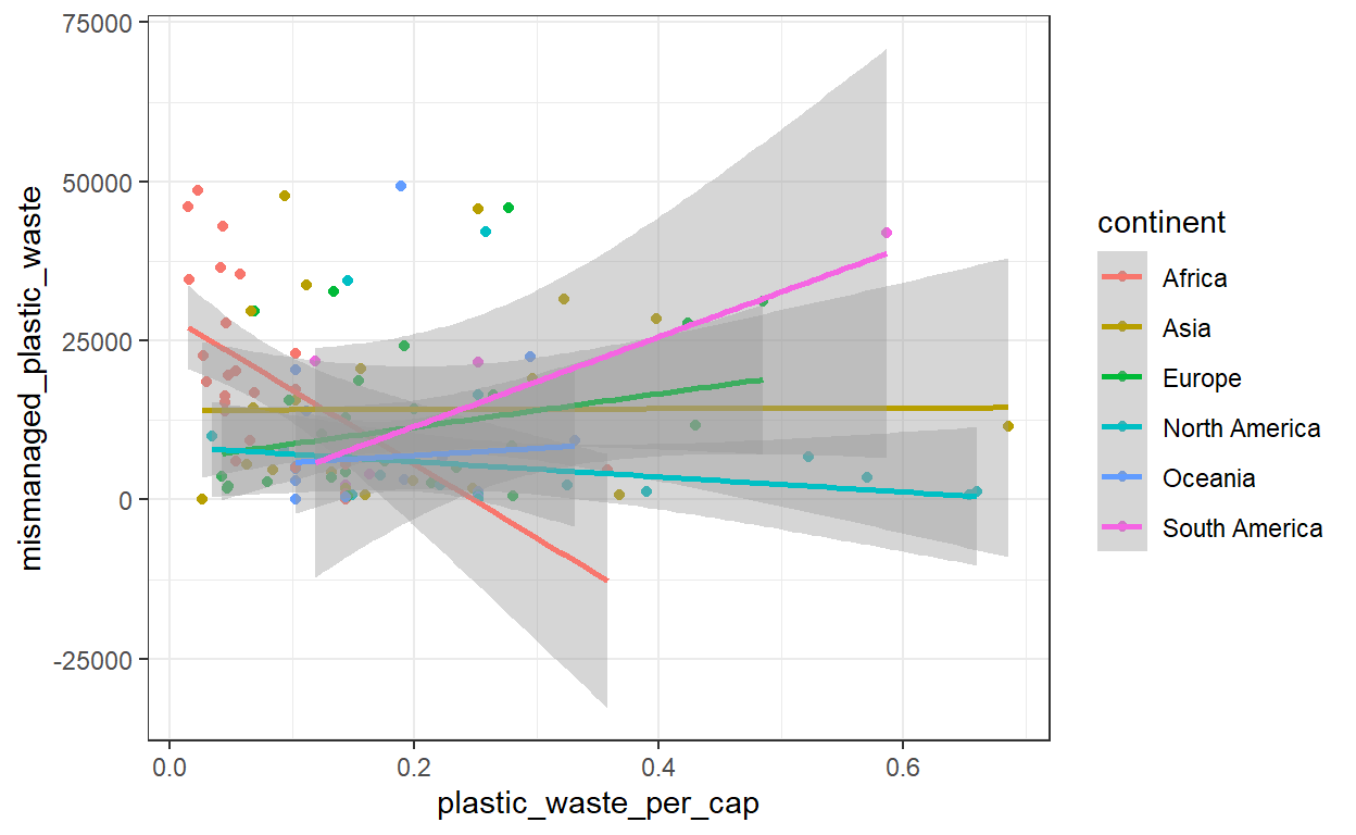
# Each continent has a very different trend. This is why it is important to explore your # dataset from a diversity of angles.Question 3
Question 3: Visualize the relationship between plastic waste per capita and total population as well as plastic waste per capita and coastal population. Do either of these pairs of variables appear to be more strongly linearly associated?
ggplot(plastic_waste_no_outliers, aes(y = plastic_waste_per_cap, x = total_pop)) +
  geom_point() +
  theme_bw() +
  geom_smooth(method = 'lm')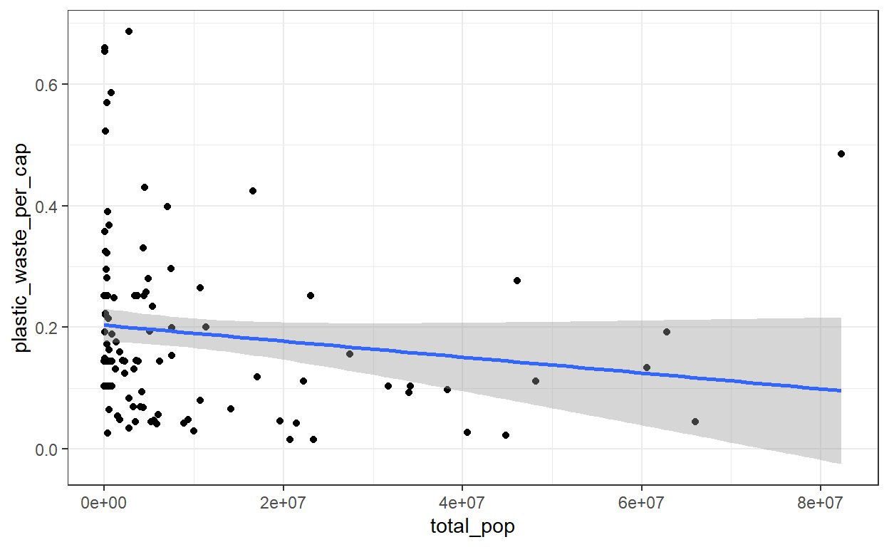
# The more persons a country has, the less waste per capita.

ggplot(plastic_waste_no_outliers, aes(y = plastic_waste_per_cap, x = coastal_pop)) +
  geom_point() +
  theme_bw() +
  geom_smooth(method = 'lm', color = 'red')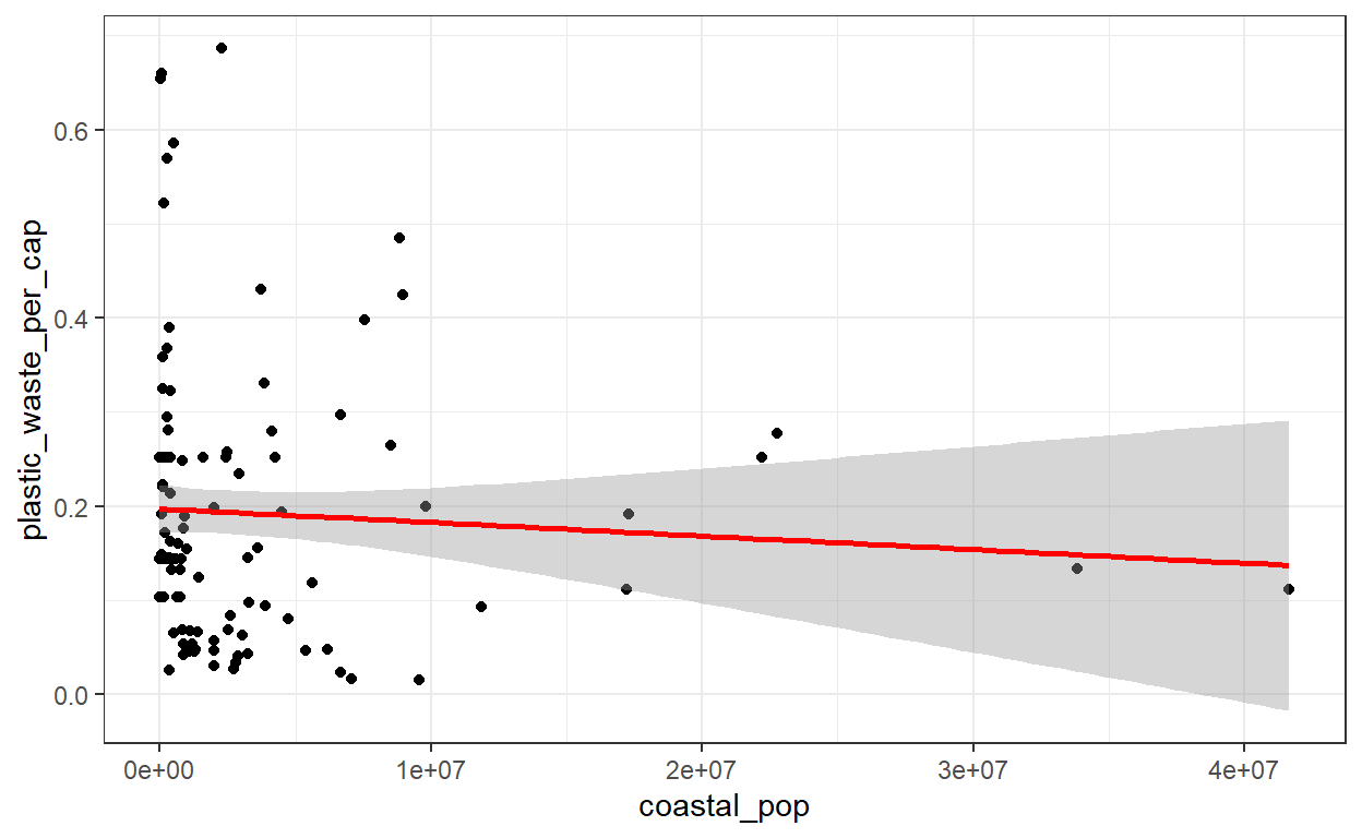
# The more persons a country has, the less waste per capita. Nevertheless, the trend doesn't seem as strong as in the first plot.Question 4
Question 4: Recreate the following plot and think about what is wrong about it, how could you make it better?
Here is the code for the plot:
# Load the library viridis which give us a nice color palette
library(viridis)

# Code for the plot
ggplot(plastic_waste, aes(x = coastal_pop, y = plastic_waste_per_cap, color = continent) +
  geom_point() +
  scale_color_viridis(discrete = TRUE) +
  geom_smooth(col = 'black') +
  labs(title = "Plastic waste vs. coastal population proportion",
       subtitle = "by continent",
       x = "Coastal population proportion",
       y = "Plastic waste per capita",
       color = "Continent")
We can improve this plot by removing the outliers from the plot as we did previously. This will give us a better view of the general trend.
Another thing that is not optimal with this plot is that the points seem cluster: most of the points are on the left of the plots while some others are on the far right. The range of values in the variable population is very large and this may impede the visual. We can solve this dilema by taking the log of coastal population. By taking the log, which is a mathematical transformation, we give an order of magnitude to the variable population and we do not reason only in terms of raw numbers.
Let’s have a look at the plot:
# Remove the outliers
plastic_waste_no_outliers2 <- plastic_waste %>%
  filter(plastic_waste_per_cap < 1)

# Plot the dataset
ggplot(plastic_waste_no_outliers2, aes(x = log(coastal_pop), y = plastic_waste_per_cap, color = continent)) +
  geom_point() +
  viridis::scale_colour_viridis(discrete = TRUE) +
  geom_smooth(col = 'black') +
  labs(title = "Plastic waste vs. coastal population proportion",
       subtitle = "by continent",
       x = "Coastal population proportion",
       y = "Plastic waste per capita",
       color = "Continent")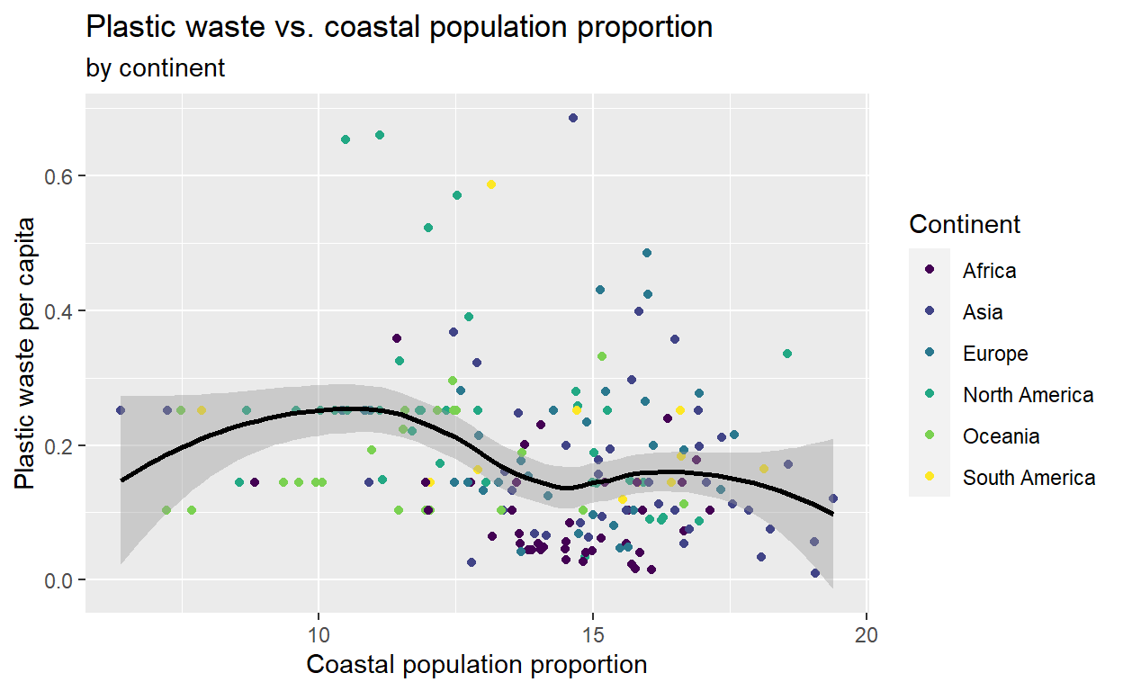
filter() and the pipe %>%
Previously, I have used filter() and the pipe %>%, two things which can improve the way you handle dataset.
filter()
One of these tasks in data analysis is to select a subset of cases in the data that satisfy a given logical condition. That’s exactly what the filter function does. It selects or filters the rows of the data table that meet certain criteria creating a new data subset.
For instance, going back to the kids dataset we have seen in the first lab:
kids_frame <- data.frame(
  names = c("Tor", "Gus", "Bob", "Di", "Lena", "Tony", "Ingrid", "Maria", "Ed", "Raghnild"),
  height = c(110, 130, 115, 140, 125, 135, 120, 130, 130, 115),
  shirt_color = c("green", "green", "green", "blue", "blue", "green", "blue", "green", "green", "blue"),
  shoe_color = c("blue", "red", "grey", "blue", "pink", "red", "grey", "pink", "pink", "blue"),
  sex = c("m", "m", "m", "f", "f", "m", "f", "f", "m", "f"),
  age = c(8,11,8,12,11,11,9,12,12,8))
If I am only interested in the males:
kids2 <- dplyr::filter(kids_frame, sex == 'm')
# I write dplyr::filter to tell R that I want to use the filter function from the #package dplyr. Other filter function exist and we need to avoid any misunderstanding.
head(kids2)
  names height shirt_color shoe_color sex age
1   Tor    110       green       blue   m   8
2   Gus    130       green        red   m  11
3   Bob    115       green       grey   m   8
4  Tony    135       green        red   m  11
5    Ed    130       green       pink   m  12
The pipe %>%

For a full explanation of the pipe refer to the Chapt 18 of R4DS
The point of the pipe is to help you write code in a way that is easier to read and understand. It is increasingly used in R programming and it is important to understand how it works. The pipe works basically as a then in a sentence. For instance, in english you would say:
# I woke up, then showered, then dressed, then glammed up, then took breakfastIn R, with the pipe that would be translated by:
I woke up %>% showered %>% dressed %>% glammed up %>% took breakfastLet’s take the example of the filter. If I want to use the pipe to create a new dataset with only Gus, Bob and Di I would write:
kids2 <- kids_frame %>% filter(., sex == 'm') # The . is used to symbolize the previous object which is kids_frame in that caseYou can chain the function with %>%. For instance, suppose we want to isolate the males from the kids_frame and make a histogram of their height. We would write:
kids_frame %>%
  filter(., sex == 'm') %>%
  ggplot(., aes(x = height)) +
  geom_histogram()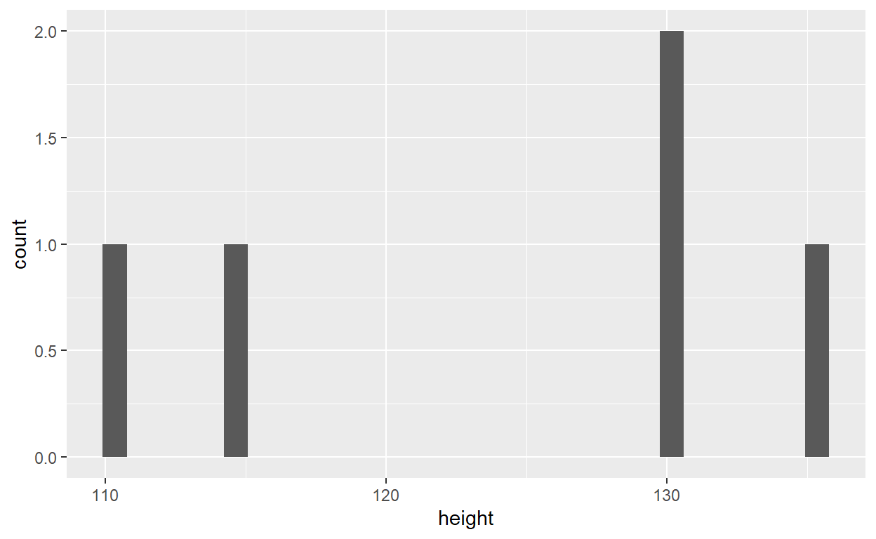
Note: The computer shortcut for the pipe is
Ctrl+Shift+M
A new dataset to visualize
In January 2017, Buzzfeed published an article on why Nobel laureates show immigration is so important for American science. You can read the article here. In the article they show that while most living Nobel laureates in the sciences are based in the US, many of them were born in other countries. This is one reason why scientific leaders say that immigration is vital for progress. In this lab we will work with the data from this article to recreate some of their visualizations as well as explore new questions.
First, download the dataset here:
The data
nobel <- read.csv('C:/Users/benjamcr/Rproj/GEOG3006/data/nobel.csv')
head(nobel)
  id      firstname   surname year category
1  1 Wilhelm Conrad  Röntgen 1901  Physics
2  2     Hendrik A.   Lorentz 1902  Physics
3  3         Pieter    Zeeman 1902  Physics
4  4          Henri Becquerel 1903  Physics
5  5         Pierre     Curie 1903  Physics
6  6          Marie     Curie 1903  Physics
                                                                                                      affiliation
1                                                                                               Munich University
2                                                                                               Leiden University
3                                                                                            Amsterdam University
4                                                                                            École Polytechnique
5 École municipale de physique et de chimie industrielles (Municipal School of Industrial Physics and Chemistry)
6                                                                                                            <NA>
       city     country  born_date  died_date gender  born_city
1    Munich     Germany 1845-03-27 1923-02-10   male  Remscheid
2    Leiden Netherlands 1853-07-18 1928-02-04   male     Arnhem
3 Amsterdam Netherlands 1865-05-25 1943-10-09   male Zonnemaire
4     Paris      France 1852-12-15 1908-08-25   male      Paris
5     Paris      France 1859-05-15 1906-04-19   male      Paris
6      <NA>        <NA> 1867-11-07 1934-07-04 female     Warsaw
  born_country born_country_code  died_city died_country
1      Germany                DE     Munich      Germany
2  Netherlands                NL       <NA>  Netherlands
3  Netherlands                NL  Amsterdam  Netherlands
4       France                FR       <NA>       France
5       France                FR      Paris       France
6       Poland                PL Sallanches       France
  died_country_code overall_motivation share
1                DE               <NA>     1
2                NL               <NA>     2
3                NL               <NA>     2
4                FR               <NA>     2
5                FR               <NA>     4
6                FR               <NA>     4
                                                                                                                                                      motivation
1                            "in recognition of the extraordinary services he has rendered by the discovery of the remarkable rays subsequently named after him"
2                       "in recognition of the extraordinary service they rendered by their researches into the influence of magnetism upon radiation phenomena"
3                       "in recognition of the extraordinary service they rendered by their researches into the influence of magnetism upon radiation phenomena"
4                                                   "in recognition of the extraordinary services he has rendered by his discovery of spontaneous radioactivity"
5 "in recognition of the extraordinary services they have rendered by their joint researches on the radiation phenomena discovered by Professor Henri Becquerel"
6 "in recognition of the extraordinary services they have rendered by their joint researches on the radiation phenomena discovered by Professor Henri Becquerel"
        born_country_original     born_city_original
1       Prussia (now Germany) Lennep (now Remscheid)
2             the Netherlands                 Arnhem
3             the Netherlands             Zonnemaire
4                      France                  Paris
5                      France                  Paris
6 Russian Empire (now Poland)                 Warsaw
  died_country_original died_city_original city_original
1               Germany             Munich        Munich
2       the Netherlands               <NA>        Leiden
3       the Netherlands          Amsterdam     Amsterdam
4                France               <NA>         Paris
5                France              Paris         Paris
6                France         Sallanches          <NA>
  country_original
1          Germany
2  the Netherlands
3  the Netherlands
4           France
5           France
6             <NA>
The variable descriptions are as follows:
- id: ID number
- firstname: First name of laureate
- surname: Surname
- year: Year prize won
- category: Category of prize
- affiliation: Affiliation of laureate
- city: City of laureate in prize year
- country: Country of laureate in prize year
- born_date: Birth date of laureate
- died_date: Death date of laureate
- gender: Gender of laureate
- born_city: City where laureate was born
- born_country: Country where laureate was born
- born_country_code: Code of country where laureate was born
- died_city: City where laureate died
- died_country: Country where laureate died
- died_country_code: Code of country where laureate died
- overall_motivation: Overall motivation for recognition
- share: Number of other winners award is shared with
- motivation: Motivation for recognition
Demo analysis
Let’s have a look at the distribution of nobel prices across countries.
nobel_cntry <- nobel %>%
  dplyr::filter(!is.na(country)) %>%
  dplyr::group_by(country) %>%
  dplyr::summarise(n = n())
head(nobel_cntry)
# A tibble: 6 x 2
  country       n
  <chr>     <int>
1 Argentina     2
2 Australia     4
3 Austria       6
4 Belgium       5
5 Canada        8
6 China         1
# Plot the number of nobel prices per country
nobel_cntry %>%
  ggplot(., aes(x = country, y = n)) +
  geom_point() +
  labs(title = "Number of nobel prices per country",
       xlab = "Number of nobel prices",
       ylab = "Country")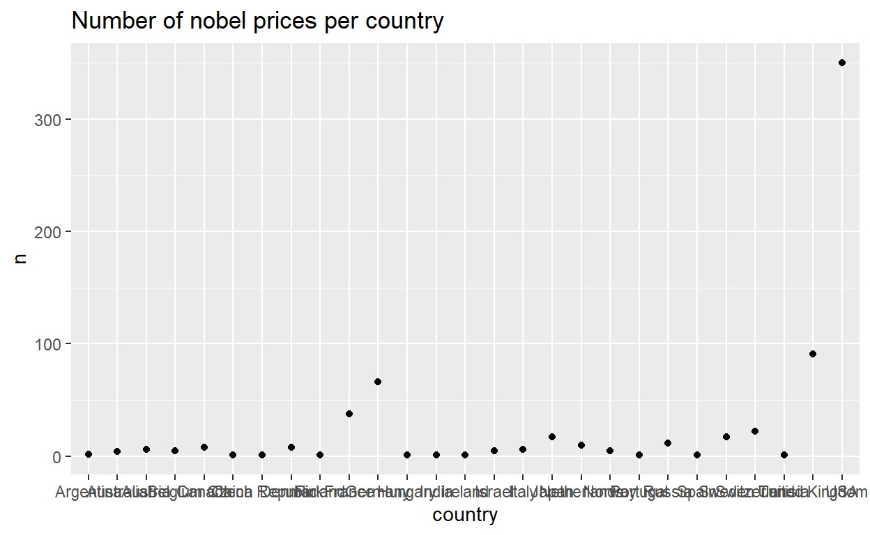
Can you guess what
group_byandsummariseare doing in the code above?
We can improve this plot and have a better visualization. If we want this figure in a report for instance.
nobel_cntry %>%
  ggplot(., aes(x = country, y = n)) +
  geom_point(size = 3, color = "#a25079") +
  geom_segment(aes(x = country, xend = country, y=0, yend = n), color = "grey") +
  coord_flip() +
  theme_minimal() +
  labs(title = "Number of nobel prices per country",
       xlab = "Number of nobel prices",
       ylab = "Country")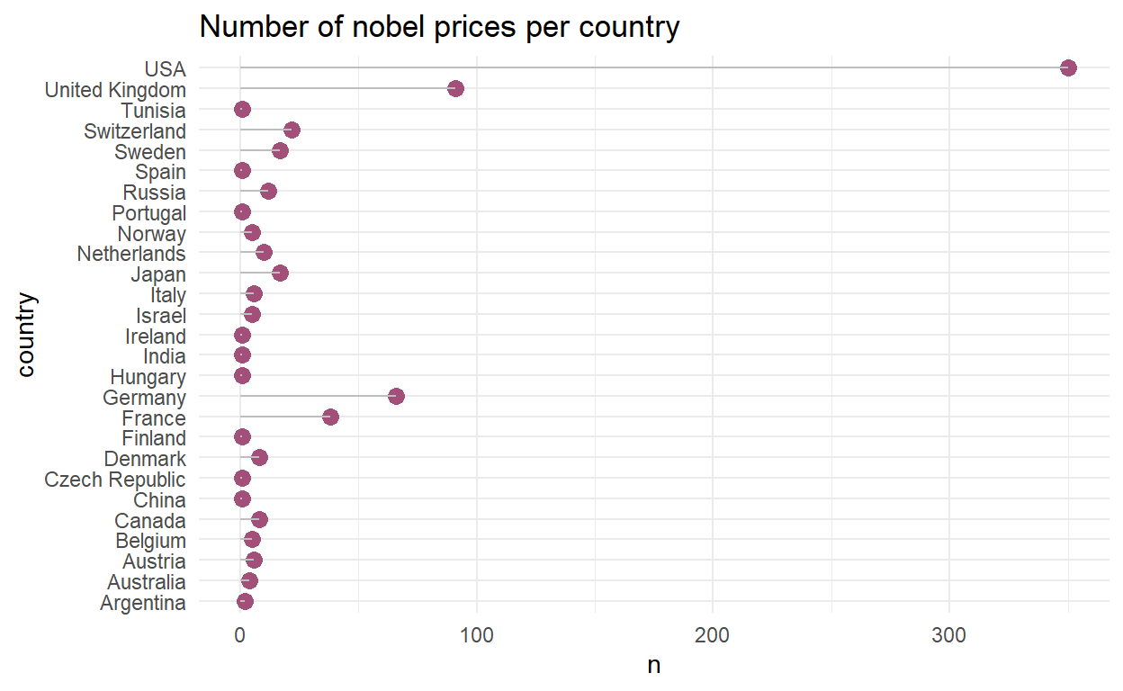
group_by() and summarise()
The two functions group_by() and summarise() are often used in pair. The group_by function will split any operations applied to the dataframe into groups defined by one or more columns. summarise will perform an operation on a group that was defined by group_by or on the entire dataframe if group_by hasn’t been used.
A simple example with the kids_frame dataset.
Suppose I want to get the average age for each sex, not for both. One way could be to subset the dataset to create a “male” and a “female” dataset. However, this takes some more lines of code. A more efficient way would be to use group_by and summarise:
kids_frame %>%
  dplyr::group_by(sex) %>%
  dplyr::summarise(mean_age = mean(age))
# A tibble: 2 x 2
  sex   mean_age
  <chr>    <dbl>
1 f         10.4
2 m         10
# The average age for female is 10.4 years old and 10 yo for the malesInstead of the function mean it is also possible to a wide range of functions including min (to know the minimal value), max (to know the maximale value) …
Exercise: get to know your data
Question 1: How many observations and how many variables are in the dataset?
Question 2: How many woman won a nobel price? How many men?
Question 3: Create a new data frame called nobel_living that filters for
- laureates for whom country is available (you can use the function
drop_na(), look on google what it does!) - females laureates who are still alive (their died_date is NA)
Question 4: With this new dataset, summarize the number of females laureate who are still alive by country and make a histogram of the number of female laureates per country. Your histogram should include a title and title for the axis.
Question 5: Which country has the most female laureates?